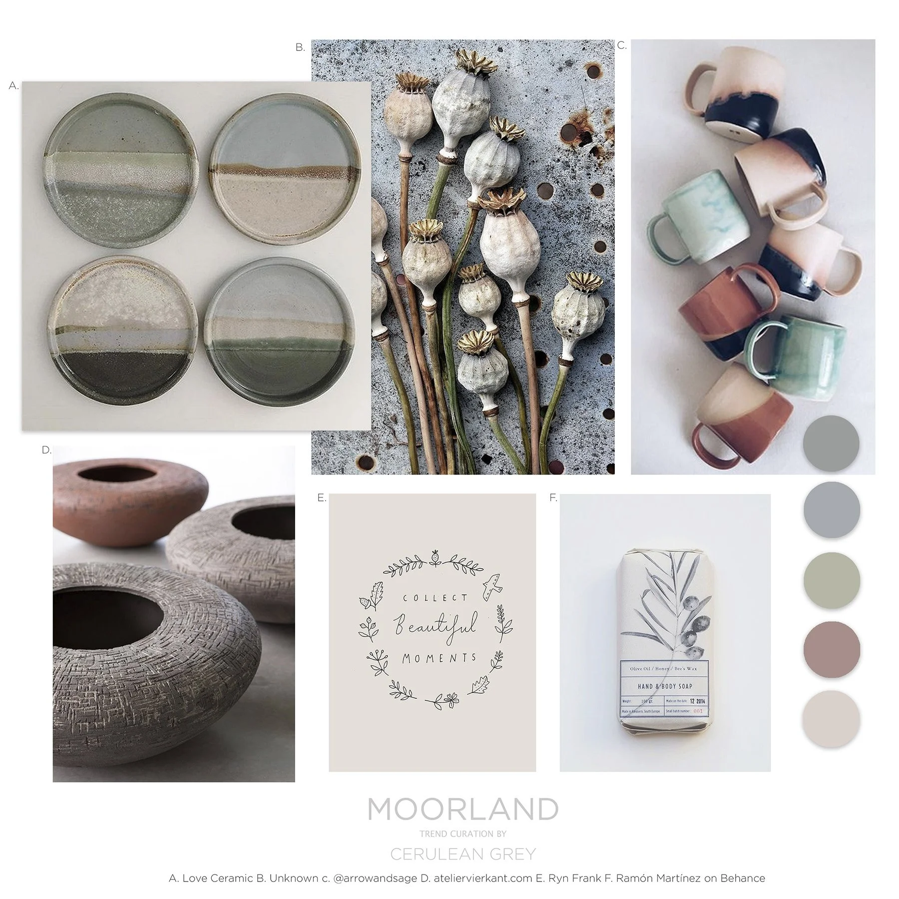
Moorland
I wanted to go full on brutalist with this story but then decided it wasn’t hugely commercial or easy to work with so I toned it down. Part Nordic, part brutalist, part Japanese vibes it again is a melting pot of influences.
I toned down the hard lines and coldness of the metals with reactive glazes and hand drawn patterns. I then took inspiration from the Yorkshire moorlands for the colour palette and textures. I think this sits so nicely against the hard lines of the furniture and metalwork that I showed on the previous posts.
What I want to achieve with these design stories is to show you how you can use trends such as brutalism but make them more commercial and inline with your customer base. .


